
More Than Just a Toggle
In 2019, Apple introduced system-wide Dark Mode to iOS. Suddenly, the world went dark.
Developers loved it because it saved their eyes during late-night coding sessions. But for designers, Dark Mode opened up a new psychological frontier.
It wasn’t just about utility anymore. It was about mood.
The Color of Luxury
Psychologically, white space conveys openness, cleanliness, and honesty. It is the color of a hospital, an art gallery, or a tech startup.
Black, on the other hand, is the color of luxury, mystery, and power.
Think about a high-end jewelry store. The velvet is black. The cases are dark. Why? Because darkness focuses the eye. When the background recedes into the void, the object in the foreground—the diamond, the watch, the product—pops with incredible intensity.
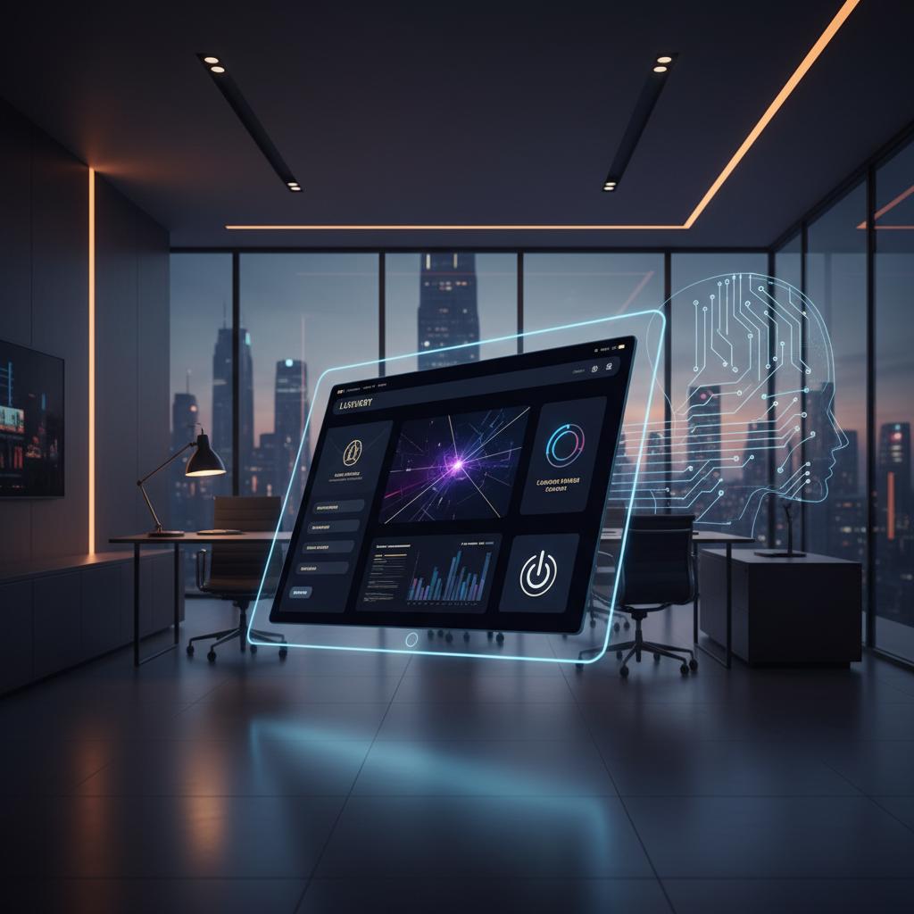
At WebGlo, we use Dark Mode strategically for clients who want to signal exclusivity. Our automotive clients, nightlife brands, and premium tech products all benefit from a dark-first design aesthetic.
The Focus Factor
Dark interfaces are “cinematic.”
When you watch a movie, you turn off the lights. You want the environment to disappear so you can immerse yourself in the screen.
We apply this same logic to web design. For media-heavy sites—portfolios, video platforms, automotive showcases—a dark background removes visual noise. It forces the user to focus entirely on the content.
Consider the difference between watching a movie on your phone at full brightness in a lit room versus in a dark room with the screen slightly dimmed. The second experience is more immersive, more emotional, and more memorable.
A dark website creates that same second experience.
The Technical Challenge: It’s Not Just “Invert Colors”
Designing for Dark Mode is harder than it looks. You cannot just invert black to white.
- Avoid Pure Black: We rarely use
#000000. Pure black causes “smearing” on OLED screens when scrolling. We use rich, dark grays (#121212) or deep navies. - Contrast Ratios: Text is harder to read on a dark background. We have to carefully calibrate font weights and colors to ensure accessibility standards (WCAG) are met. A light gray text on dark gray background might look stylish but fail accessibility requirements.
- Depth: In Light Mode, we use shadows to create depth. In Dark Mode, shadows are invisible. We have to use “elevation”—lighter shades of gray—to show that an object is sitting on top of another.
- Image Treatment: Photos designed for light backgrounds often look washed out on dark ones. We often apply subtle vignettes, boost contrast, and adjust the overall color grading to ensure product photos pop against a dark background.
The Hybrid Approach: System-Aware Design
Modern browsers and operating systems allow us to detect whether a user prefers dark or light mode via the CSS prefers-color-scheme media query.
This lets us build adaptive websites that automatically switch between light and dark themes based on the user’s system settings. For brands that serve a broad audience, this is the most sophisticated approach: the site feels native to the user’s environment.
However, for brands where the dark aesthetic is central to the identity—like our automotive or entertainment clients—we maintain a fixed dark mode regardless of system preference. The brand statement is more important than the user’s default setting.
Should Your Site Go Dark?
Not every business needs a dark site. A pediatric dentist office should probably stay light and airy.
But here is a quick guide to help you decide:
Consider Dark Mode if:
- You sell luxury goods, high-end services, or premium tech products.
- Your brand is associated with nightlife, entertainment, gaming, or automotive culture.
- Your site is media-heavy (video, photography, interactive visualizations).
- Your target audience skews toward younger, tech-savvy demographics.
Stick with Light Mode if:
- You serve healthcare, education, or family-oriented markets.
- Your audience includes a significant percentage of older users.
- Your primary content is long-form reading (dark mode increases eye strain for extended reading).
- Your brand identity is built around brightness, energy, and approachability.
The right answer is the one that aligns with your brand personality and serves your audience’s needs.
Check out our Redlined Case Study to see Dark Mode used to perfection.
Was this article helpful?