
Beyond the Logo
When the founders of Redlined approached us, they didn’t ask for a logo. They asked for a flag.
They weren’t building a company; they were building a tribe. They were a group of automotive enthusiasts who lived for the adrenaline of the redline—that moment when the tachometer hits the limit and the engine screams.
Our challenge: How do you capture that visceral feeling in a static brand identity?
The Research Phase: Understanding the Culture
Before we designed a single element, we spent two weeks immersed in automotive culture.
We attended car meets in northern New Jersey at 2 AM. We scrolled through car culture forums, studied the aesthetics of JDM import scenes, and analyzed the brands that had succeeded—and those that had tried and failed—in this space.
What we learned: automotive communities have an extraordinary radar for inauthenticity. A brand that doesn’t understand the culture gets mercilessly rejected. A brand that gets it right becomes a badge of honor.
This research phase isn’t optional for us. It is the foundation on which every design decision is built.
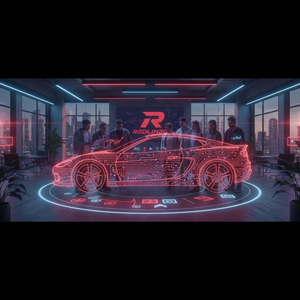
The Aesthetic of Speed
We knew that a corporate, clean, “tech” look would fail. This brand needed to smell like gasoline and burnt rubber.
We developed a visual language based on Aggression and Precision.
1. The Typography
We chose a custom typeface with sharp, forward-leaning angles. It looks fast even when it’s standing still. It mimics the aerodynamic lines of a GT3 race car. We paired it with a tight-tracked, all-caps display weight for headlines and a precision-engineered monospaced face for data and specs—like reading a dyno sheet.
2. The Color Palette
We bypassed the standard “Ferrari Red.” Instead, we chose a palette of Asphalt Black, Chrome Silver, and a piercing Neon Red that vibrates against dark backgrounds. It’s the color of a brake light in the rain.
3. The Imagery
We moved away from staged “showroom” photos. We focused on motion blur, grain, and high-contrast night shots. We wanted the viewer to feel like they were in the passenger seat at 3 AM.
Every image in the brand library was shot at actual events—in the wild, under real conditions. This authenticity cannot be faked with stock photography.
Building the Digital Clubhouse
A community brand needs a home.
We built a digital platform that wasn’t just a brochure—it was a clubhouse.
- Member Spotlights: A section dedicated to the stories of individual drivers and their builds, with photo galleries and spec sheets.
- Event Drops: A “hype” system for releasing event tickets that created scarcity and demand. Events would sell out in under an hour.
- Merch Drops: An integrated e-commerce store for limited-edition apparel, with countdown timers to create anticipation.
- Build Registry: A searchable database where members could showcase their cars, modifications, and track times.
The platform became a destination, not just a landing page.
The Brand Voice
Visual identity is only half the equation. We also defined the brand voice.
Redlined’s copy is blunt, direct, and unapologetic. It doesn’t explain itself. It doesn’t use corporate language. It speaks the way gear-heads talk to each other at a Friday night meet: direct, confident, and deeply knowledgeable.
“Built. Not Bought.” “Rev it or leave it.” “The redline is just the beginning.”
This voice was documented in a brand standards guide and used consistently across every touchpoint: social media, email, merchandise hang tags, and event flyers.
The Result
Redlined didn’t just launch; it exploded.
Within 3 months, they had 5,000 active members. Their first merch drop sold out in 12 minutes. They became more than a car club; they became a lifestyle brand.
This is the power of Community Branding. It’s not about selling a product; it’s about selling an identity.
See how we translate horsepower into HTML in our deep dive on automotive web design.
Was this article helpful?