
It’s About the Stance
In car culture, “stance” is everything. It is how the car sits on its wheels. Is it aggressive? Is it low? Is it wide?
A website has a stance, too.
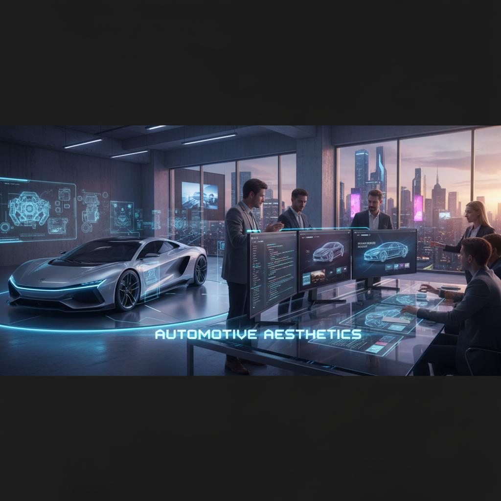
When we design for automotive clients like Redlined or Slo, we cannot use a standard, boxy Bootstrap grid. That feels like a minivan. We need the site to feel like a coupe.
We use asymmetrical layouts and dynamic whitespace to create a sense of motion, even when the user is standing still. Diagonal section dividers mimic the aerodynamic lines of a well-designed spoiler. Negative space is not empty—it is the breathable gap between the car and the road.
Typography as Engine Noise
Fonts have a sound.
- Serif fonts sound like a library.
- Rounded sans-serifs sound like a tech startup.
- Wide, bold, italicized sans-serifs sound like a V8 engine at 7,000 RPM.
For our automotive projects, we choose typography that feels mechanical and precise. We often mix monospaced fonts (reminiscent of technical specs and dyno sheets) with aggressive display fonts that lean forward, literally.
The text shouldn’t just be read; it should feel like it is moving 100mph.
Typography choices are never arbitrary. A wide-tracked, all-caps display font in the hero section signals authority and raw power. A slightly tighter weight in the body copy makes the reading experience feel precise and engineered—like reading the service manual for a Ferrari.
Speed is a Feature
Automotive enthusiasts are obsessed with performance. If a car site loads slowly, it is an insult to the subject matter.
We optimize these sites aggressively. We use next-gen image formats (WebP/AVIF) to deliver high-resolution car photography without the bloat. We use lazy loading so the initial “launch” of the page is instant.
A slow automotive site is the digital equivalent of showing up to a track day in a minivan. It destroys the brand narrative before the user has even scrolled past the hero.
Our typical target for automotive builds: a Lighthouse Performance score of 95+, a Time to Interactive under 2 seconds, and an LCP (Largest Contentful Paint) under 1.2 seconds. These numbers aren’t vanity—they directly affect how Google ranks the site in search results.
The Visceral Experience
Finally, cars are a sensory experience. You don’t just look at them; you hear them.
While we are careful with auto-playing audio (it’s usually a bad UX practice), we often use video backgrounds to capture the visceral energy of the automotive world. The shimmer of light on paint, the rotation of a wheel, the blur of the road.
Cursor interactions also play a role. A subtle parallax effect on a hero image can make a static photo feel three-dimensional. A hover state that reveals an exhaust note waveform as a decorative element tells the user: this site understands us.
The Color Language of Speed
Color isn’t decoration in automotive design—it’s communication.
- Matte black or deep charcoal — Signals aggression, exclusivity, the underground.
- Bright yellow or lime — Energy, track-readiness, late-night meetups.
- Chrome and silver — Precision engineering, motorsport heritage.
- Deep red (not Ferrari-bright, but Bordeaux dark) — Power, passion, the heartbeat of the machine.
We never use colors from a free color palette generator. We pull colors from actual car finishes—Midnight Purple (Nissan R34), Imola Orange (BMW M5), Targa Florio Yellow (Porsche). The palette is authentic because it comes from the culture itself.
Building for the Community
The most successful automotive sites aren’t just marketing brochures. They are gathering places.
We incorporate event calendars, member spotlight sections, and gallery feeds that pull from social media. We build these features not because they look impressive, but because they give the community a reason to return. Return visits build loyalty. Loyalty builds a brand.
Translating horsepower into HTML isn’t about pasting a picture of a car on a page. It’s about capturing the adrenaline of the drive—and building a digital home for the people who live for it.
Was this article helpful?